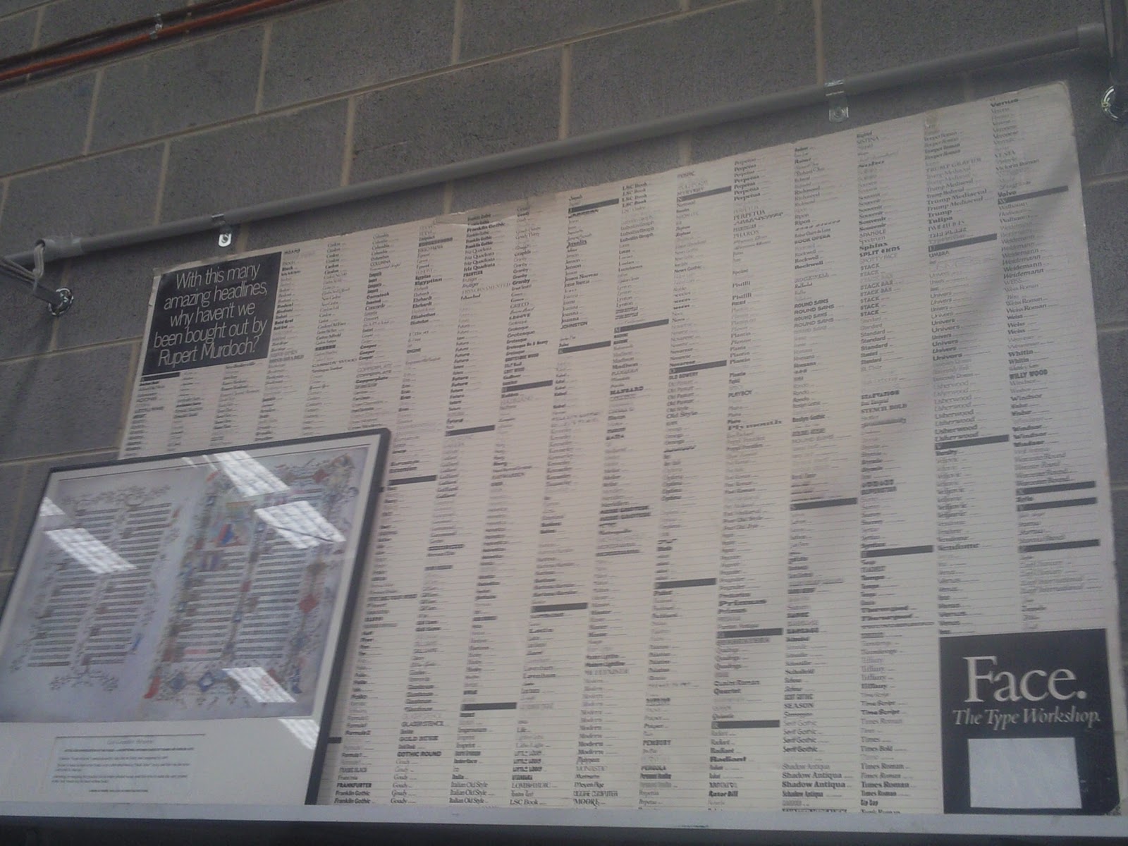
Lorry gave us a brief introduction about the place and then our guide, Michael started on the history of typography and printing. We were told about impositions (planning of how pages form in books) and the letterpresses. I found this part interesting to learn about as the negatives of text becomes a positive when it is printed. When we later developed our own printing of our names, its funny to see that everything was backwards and upside down at first, but when printed onto paper it forms the right way up and side. We looked around the front of the museum, a A1 board of fonts interested me with this quote in particular, "with this many amazing headlines, why haven't we been bought out by Rupert Murdoch. I talked to Michael briefly about the amount of fonts just used alone for headlines, can we imagine how many fonts there is out there if that was just headline fonts?
* Picas and Inches, which were the standard measurements for a font size.
In the USA, the standard size for a pica is 1/6 of an inch to make a size 12 font. An inch is 25mm
* "Printer's pie" refers to the split type, this is when type in the forme can be shorter in one line and then become looser than the next...
* Forme/ Chase: the steel frame that holds the text/words.
*Quoine: pushes the type into the corners of the chase.
We learnt about mats/ matrix, which were used to assemble a word together, followed by type cases. Upper case fonts got its name as they were in alphabetical order in the cases and Lower case fonts were just in the bottom for convenience.
Michael told us about kerning – to create a nicer style for the fonts, as we already knew from Jennine's class, but Michael went into more depth about it which was good.
There was 3 parts to the museum, the composing area, the printing area and the finishing area.
The composing area consisted of the letters, which you composed the words letter by letter. The printing area which had the paper and press machines, etc and the finishing area for binding.
We were able to create our names on the linoprint machine by Lorry but we got to ink and create a certificate like thing to remember our trip. We had to find the letters ourselves and create the words which Michael then made for us from the melted metal.
Overall it was a good experience that helped us understand the history of printing and how letters were made and how easy we have it now with computers to do all our calculations for a font size for us. The best part was watching Scott do some of the printing using different fonts, text and paper. The work he did looked really unique and vintage like. He made me a print but i wasn't allowed to bring it home, but i got inspiration from it anyway. It looks a little like the 9th picture below but it had fonts and type everywhere with different inks.


No comments:
Post a Comment